Charlotte Adams
Game Designer
Persona 5: Royal UI Design
Persona 5 Royal is a JRPG developed by P-Studio and published by Atlus. Set in modern day Tokyo the players follow the story of a high school student known by the codename Joker who transfers to a new school after he is falsely accused of assault and put on probation.
Persona 5 is known for its incredibly stylish and punk themed User Interface, that has attracted players to the game who would not have played any of the previous instalments of the Persona series. This is a project I undertook to investigate how the user experience could be improved, a positive UX can increase player engagement and retention, while a poor UX can cause frustration and result in players abandoning the game. So I attempted to make the UX as smooth and easy to navigate as possible.
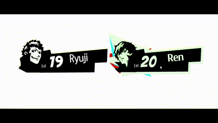
Team Select High Fidelity Prototype
Play the final prototype here
Aim of the project
The Aim of this project was to create a more Streamlined Menu system that would be more user friendly for not only players new to the Persona series but players new to JRPG's and overall reduce the cognitive load players experience. In addition the streamlined menus would hopefully reduce the amount of time existing players spend navigating the UI. This involved:
-
Creating a 'Team' section off the Main Menu
-
By selecting a character the UI will allow players to switch between the selected characters' Stats, Weapons and Skills within the same area of the Menu.
Tools and resources

Figma: the collaborative interface design tool

Adobe Photoshop 2024
Click on the Miro icon above to see my in-depth preproduction and research
Responsibilities
-
Carry out user research to tailor product to different Player Persona's.
-
Create flow diagrams to demonstrate the players journey through the UI
-
Stay true to the laws of UX to insure the interface is as accessible and easy to navigate as possible while pushing the aim to reduce cognitive load
-
Create and iterate upon scamp designs, Low and High fidelity wireframes
-
Produce an interactable prototype within Figma
-
Ensure the style of Persona 5 Royal UI is not lost
User Persona's

Susie (26)
-
Has played previous instalments in the Persona series.
-
She plays console games regularly.
-
Has a great understanding of the gameplay of Persona 5.
-
Gets frustrated with the time spent navigating the main menu of the game to find information such as stats or changing weapons.
-
Gaming experience: High

Francine (31)
-
Enjoys playing any style of game on any platform.
-
No experience with the Persona series
-
Struggles with the large amount of contextual information shown within the Menu's, Stats and inventory in games.
-
Gaming experience: Moderate

Tom (21)
-
Has played very little games.
-
Has only played on PC.
-
Wants to play games like Persona 5 more but Is discouraged by games with complicated menus/stats that are difficult to navigate and sometimes tricky to understand with limited experience.
-
Gaming experience: Low
Flow Diagrams
To improve the cognitive load on each screen was my main goal so i created flow diagrams to understand the initial navigation of the player through the Menu.
I iterated on this a couple of times to create a polished and accessible flow for the player that effectively reduces navigation time and cognitive load, as through extended research of User experience theories, this would aid the player the most and improve their experience.


The final conclusion I came to after iterating upon my flow diagrams allowed the best accessibility for players while also reducing the cognitive load.

The final idea of a natural and easy flow for players through my re-designed menu.
Design Research
When researching into creating a streamlined menu, I looked at past Persona games such as Persona 4 (2008) to see how the previous menus where laid out and how Atlus developed upon them going forward.


I also had a look at Catherine (2011) that was developed by Atlus to see how far they could push their UI/UX design wise. Producer and director Katsura Hashino actually stated in an interview Catherine was a test for the creation of Persona 5.


Looking at other JRPG's gave excellent incite into how other UI's handle large amounts of contextual information. Such as Final Fantasy VII(1997) and the games remake released in 2020 to see how the developers changed the UI from updating the graphics to how they changed the overall layout of the UI.
Post-it Investigation
I wanted to get a secure understanding of the current UI of Persona 5: Royal so I could identify what was needed for the new UI I was Resigning.


Scamps
Team Select


Persona Stats


Weapons Menu


Character Skills


I aimed to generate as many ideas as possible through quick drawing of scamps so I had many options to take forwards and expand up when moving into low and high fidelity. This was essential so I could build upon each idea.
Low Fidelity
Team Select


Name tag Iterations


Persona Stats


Weapons Menu


Character Skills Menu

High Fidelity Iterations
This where I could add my final polish to my designs as well as some simple animations, after iterating upon my ideas and wireframes. it is vital to keep in mind the punk theme of Person 5: Royal as i wanted my designs to fit in as perfectly as possible with the game.
The High fidelity also allowed me to be sure that the cognitive load has been reduced on each screen for players, so they can still enjoy the stylish UI.
Below is my high fidelity iterations of the team menu select.


I created some hovering animations in Figma and iterated upon them to add more clarity in what character the player was selecting. I wanted to use the colours in the UI already so i created a 3D glasses effect using the bright red and blue.


Style Guide
Persona 5: Royal has one of the most stylish UI's in games so throughout my design process of this challenge I created a simple style guide that I could compile all colours and fonts used to keep everything uniform and visually related.
Click below to see my style guide.
.png)